
One system, three interfaces
Staying Alive is not an application. It is an alerting system with three faces: the app in the responder’s pocket, the console in your dispatch room, and the administration back office that runs the whole thing.
Everything below is a screenshot of the working product. The dispatch console images come from our test environment, where the responders are simulated.
The dispatch console
The operator opens an alert, sees who is engaged, how far away they are and what they are doing, and can reach any of them by video or phone without leaving the screen.
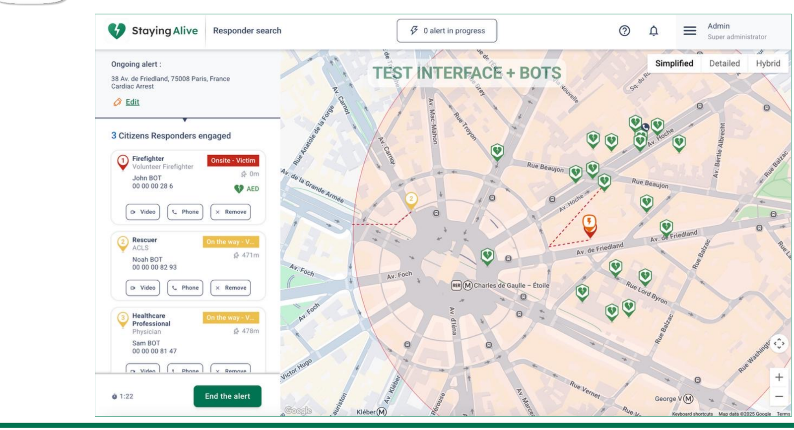
- Alert location, type and free-text detail, editable during the intervention.
- Each responder shown with their qualification, live status and distance to the victim.
- Whoever is carrying an AED is flagged, so the operator knows a defibrillator is coming.
- Video call and phone call from the same panel.
- A responder can be removed from the intervention in one click.
- Elapsed time since dispatch, and a single control to close the alert.
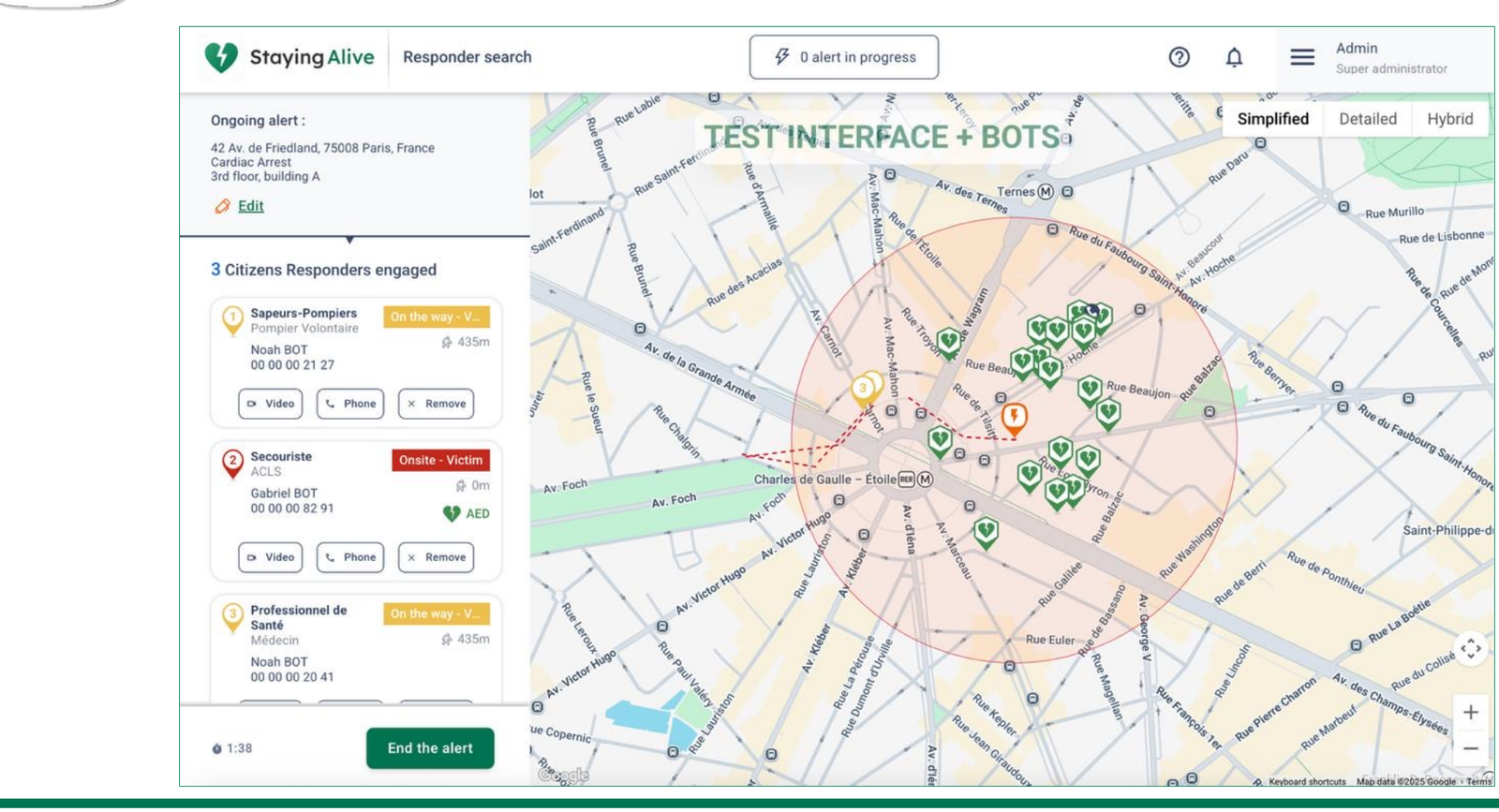
The administration back office
Multilingual, browser-based, and designed to be operated by your own staff rather than by us.
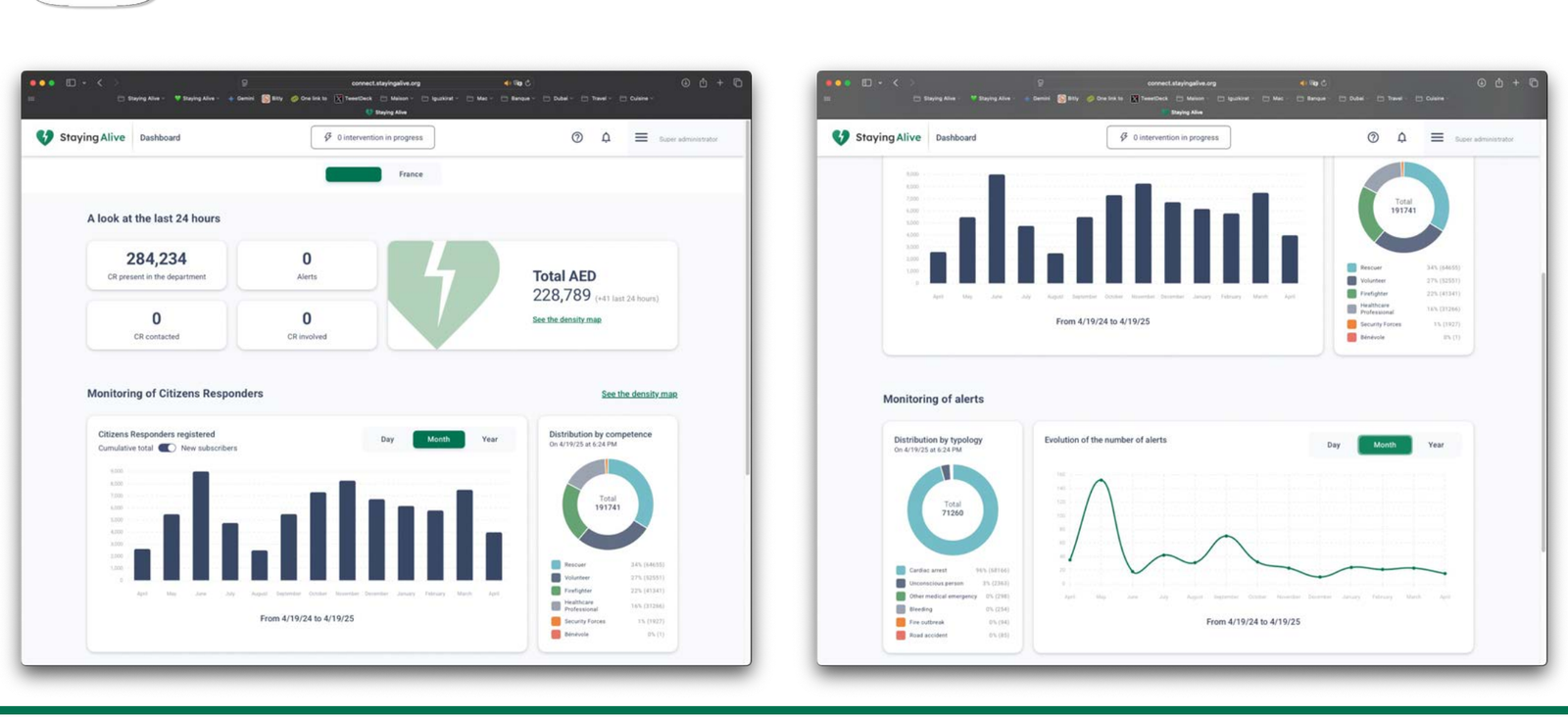
- Responder profiles, registration validation, advanced search.
- Alert history with a chronology accurate to the second, from availability to arrival on scene.
- Post-intervention questionnaire, completed by the responder and consolidated automatically.
- Live monitoring and live cardiac arrest map.
- Test mode, so your team can rehearse without triggering real responders.
What the system measures
Every intervention produces structured data. The result is an operational picture no emergency service has by default.
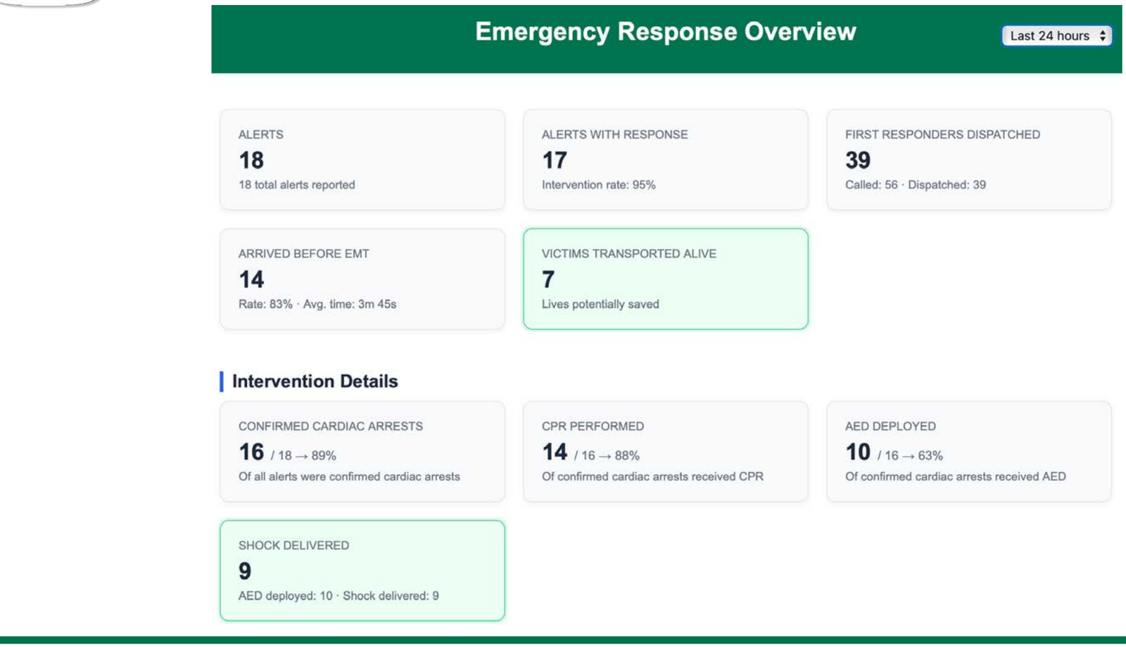
These indicators are the ones a health authority needs to justify the programme, and the ones a researcher needs to publish. They are exportable.
Planning where to act next
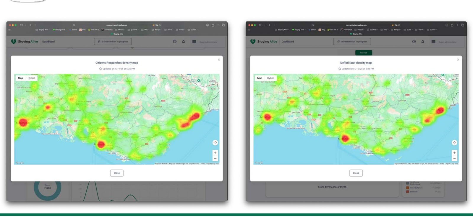
Density maps show where your responders are and where your defibrillators are not. They turn recruitment and AED placement from intuition into a targeted decision.
Want to see the console handle a live alert? We run demonstrations on our test environment, with simulated responders, in about thirty minutes.